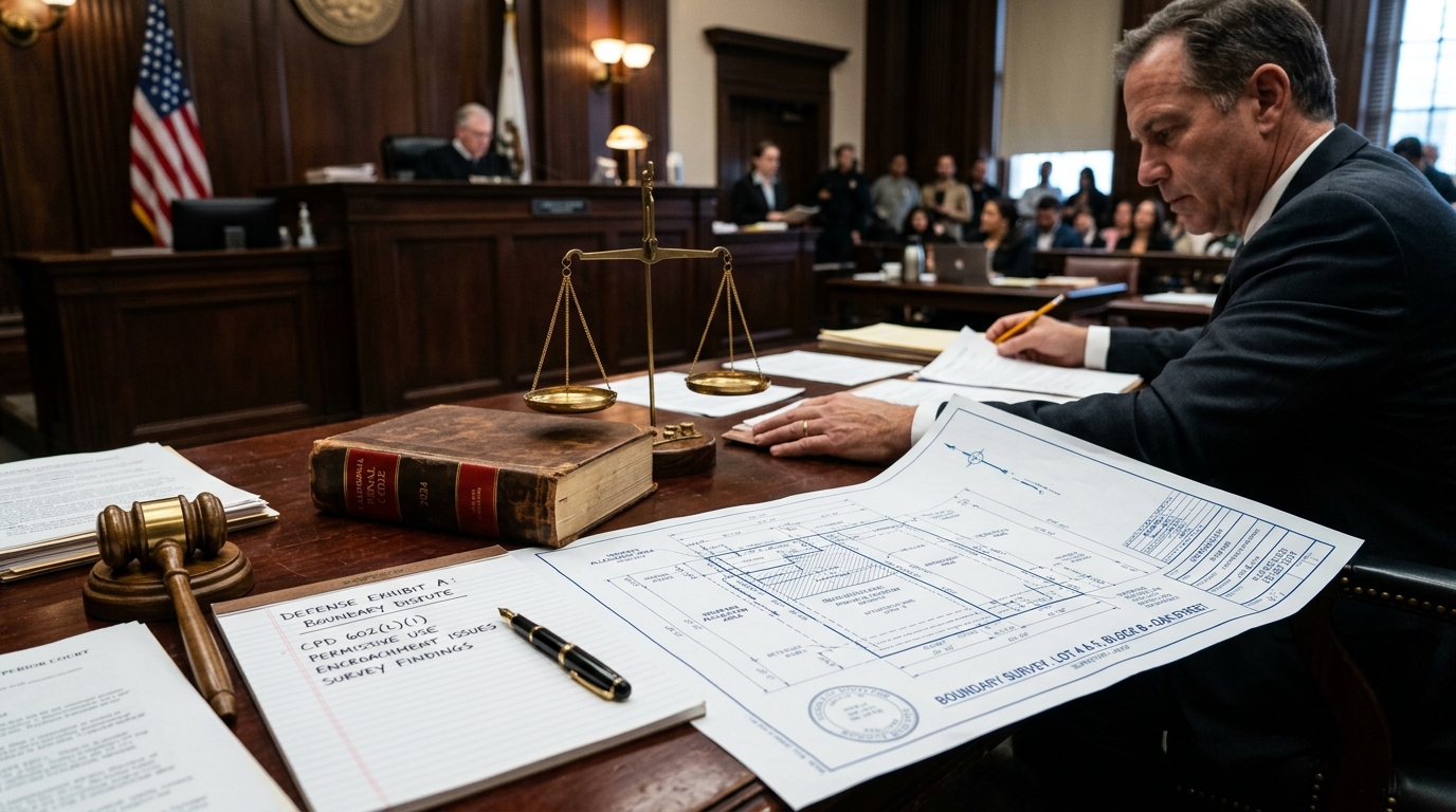
When neighborhood boundary tensions escalate over property lines, shared fencing, or tree trimming, civil property disagreements frequently cross into California criminal courtrooms as trespass, vandalism, or disturbing the peace allegations. Navigating these confrontations requires understanding both the civil statutory frameworks governing California boundaries and the precise statutory elements necessary to defend against criminal trespass under California Penal Code Section 602.
The Civil Foundation: California's Good Neighbor Fence Act (Civil Code 841)
Under California Civil Code Section 841, known as the Good Neighbor Fence Act, adjoining landowners are presumed to share equal financial responsibility for constructing, maintaining, and repairing boundary fences. However, disputes commonly erupt when one landowner undertakes unilateral fence modifications, removes existing boundary markers, or erects spite fences exceeding statutory height limits.
Crucially, a civil disagreement regarding a property boundary does not automatically give law enforcement or an aggressive neighbor grounds to sustain criminal charges. When an adjoining homeowner enters disputed land under a good-faith belief of title, color of right, or historical permissive easement, the requisite criminal intent for trespass is legally negated.
Deconstructing Criminal Trespass under California Penal Code Section 602
California Penal Code Section 602 encompasses over thirty distinct subsections defining misdemeanor criminal trespass. In residential and commercial property boundary conflicts, prosecutors most commonly file charges under:
- PC 602(m): Entering and occupying real property or structures of any kind without the consent of the owner or person in lawful possession.
- PC 602(o): Refusing or failing to leave land or buildings belonging to another upon being requested to leave by the owner or an authorized agent.
- PC 602(k): Entering land enclosed by fence or posted against trespassing without written permission.
Key Statutory Invariant: The Requirement of Willful Intent
Under California Criminal Jury Instructions (CALCRIM 2930), the prosecution must prove beyond a reasonable doubt that the defendant acted willfully and with the specific purpose of interfering with the lawful possessory rights of another. A bona fide property boundary dispute establishes a complete lack of criminal malice.
Core Legal Defenses in Escalated Property Conflicts
Experienced Los Angeles criminal defense attorneys employ several specialized defense strategies when boundary disputes trigger arrest or citation:
- Claim of Right / Good-Faith Belief: If the accused reasonably believed they had the legal right, easement, or survey authorization to enter the land, criminal intent is absent.
- Lack of Adequate Notice / Unclear Boundary: Trespass cannot be sustained on unposted or ambiguous boundary lines where no physical barriers or survey monuments clearly designate private domain.
- Consent & Permissive Historical Use: Evidence demonstrating prior historical access, mutual maintenance agreements, or implied consent undermines unlawful entry claims.
- Necessity & Emergency Property Protection: Entry undertaken to mitigate imminent structural hazards, water leaks, or falling trees is protected under the common law doctrine of necessity.
Intersection with Property Damage & Penal Code 594 (Vandalism)
When fence lines or encroaching vegetation are altered without mutual consent, prosecutors frequently attach misdemeanor or felony vandalism charges under PC 594. If the alleged property damage is under $400, the offense is a misdemeanor punishable by up to one year in county jail; damages exceeding $400 can be charged as a wobbler felony.
Defense counsel must immediately secure professional land surveys, historical aerial photography, and title records to establish the true boundary line and demonstrate that the client acted within lawful property ownership boundaries.